Chart.js教程
1. chart.js 介绍
Chart.js是一个流行的由社区维护的开源数据可视化框架。它使我们能够生成响应式条形图、饼图、线图、甜甜圈图、散点图等。我们所要做的就是简单地指出你想在页面的什么地方显示图表,你想绘制什么样的图表,然后向 Chart.js 提供数据、标签和其他设置。在这之后,这个库就完成了所有繁重的工作。
1.1. Chart.js 特点
Chart.js 是开源的,由社区共同维护的开源项目。
Chart.js 支持 8 种图表类型,每种方式都具有动态效果并且可定制。
Chart.js 使用 HTML5 Canvas 技术,在所有现代浏览器(IE11+)上都有高效的绘图效率。
Chart.js 是响应式,可以根据窗口尺寸的变化重绘所有图表,展现更加细腻。
1.2. Chart.js 相关资料
- Chart.js 官网:https://www.chartjs.org/
- Chart.js Github:https://github.com/chartjs/Chart.js
- Chart.js 文档:https://www.chartjs.org/docs/latest/
- Chart.js 实例:https://www.chartjs.org/docs/latest/samples/information.html
2. chart.js 安装
我们可以从 npm、GitHub 版本或使用 Chart.js CDN 获取最新版本的 Chart.js。
如果使用的是前端框架(例如,React、Angular 或 Vue),可以查看可用的集成 。
NPM 安装:
1
2
3
4
# 安装最新版本
npm install chart.js
# 安装指定版本
npm install chart.js@x.y.zCDN
Chart.js CDN 地址,4.0.1 版本:Staticfile(国内):https://cdn.staticfile.org/Chart.js/4.0.1/chart.js
Cdnjs(海外):https://cdnjs.cloudflare.com/ajax/libs/Chart.js/4.0.1/chart.min.js
实例:
1 |
|
使用 Chart.js
放置 canvas 画布
前面我们讲解了如何安装 chart.js 或将 chart.js 引入到我们的页面. 引入了 chart.js 后我们就可以开始使用 chart.js 了.
在使用 chart.js 库之前, 我们需要在页面放置一个<canvas>元素, 因为 Chart.js 需要使用 HTML5 画布来绘图。
首先我们需要在页面上引入 canvas 如下.
1 | <div style="width:200px; height:400px;" > |
从代码我们可以看出图表的大小比例是由 canvas 的宽度和高度来决定的, 而图表的实际宽高由父元素的宽高限定.
创建 Chart 对象
接下来我们需要创建 Canvas 对象. 在构造 Canvas 对象前, 我们需要了解它的 API 说明文档以及源代码.
通过查看Chart.js API 的官方文档 和 Chart 类源代码, 我们发现构造 Chart 对象需要传递两个参数.
Chart 对象的构造器
1 | constructor(item, userConfig) { |
ChartItem
一个参数是 item 其类型为ChartItem, 它代表我们放置在界面的 Canvas 元素, 一个参数是 userConfig 用于指定图表的类型, 例如是饼图, 还是柱状图还是其它, 以及图形所需的数据, 以及图形的样式等.
通过查看 getCanvas 函数, 我们发现 item 参数可以是一个标识 Canvas 的 id 字符串, 也可以是一个 jquery 数组例如$('#myChart'), 也可以是一个 Canvas 元素例如document.getElementById('myChart') 或者 document.getElementById('myChart').getContext('2d');
1 | function getCanvas(item) { |
userConfig
另外一个参数 userConfig, 其类型为ChartConfiguration <TType, TData, TLabel> | ChartConfigurationCustomTypesPerDataset <TType, TData, TLabel>, 由三部分组成: 类型, 数据, 和标签.
Chartjs 图表示例
以下实例我们创建一个简单的折线图
1 | const canvas = document.getElementById("myChart"); |

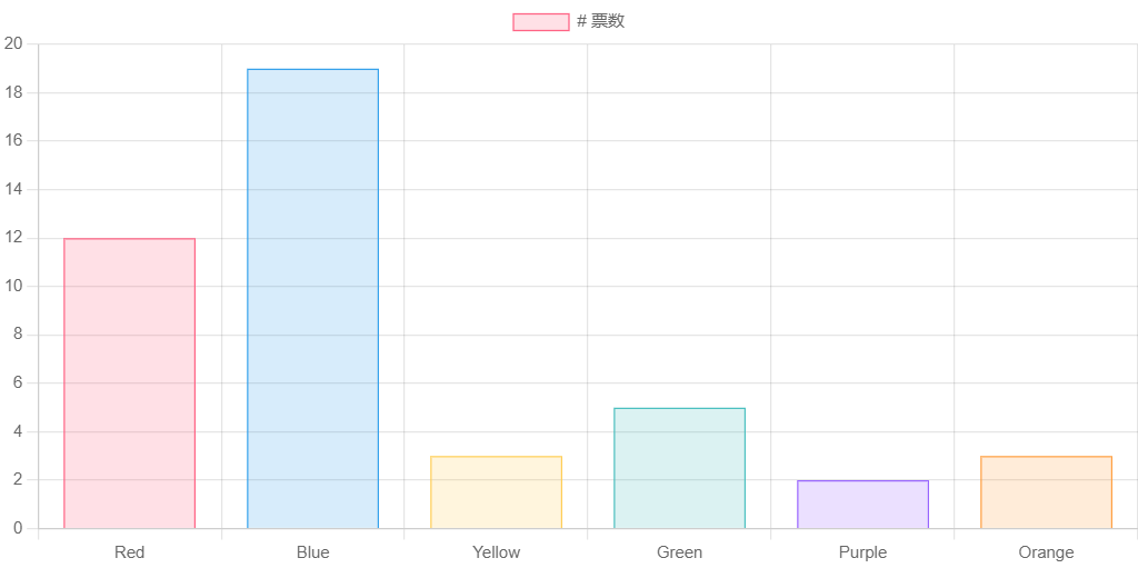
以下实例创建一个柱形图,显示不同颜色的票数。
1 | const canvas = document.getElementById("myChart"); |
接下来我们来看更多类型的 Chart 图表以及在使用这些图表的异同点.
Chart.js 柱状图
柱状图是一种以长方形的长度为变量的统计图表。
主要用于多个分类间的数据(大小、数值)的对比,可以用来显示一段时间内的数据变化或显示各项之间的比较情况,适用于二维数据集。柱状图的易用性和解释性使其成为最常用的图表之一.
柱形图的 type 属性为 bar ,type 描述了图表类型。
接下来我们创建一个简单的柱形图:
1 | const canvas = document.getElementById("myChart"); |
以上实例输出结果为:
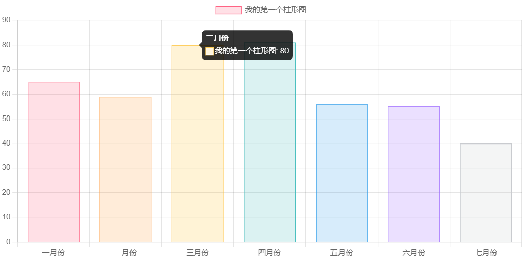
chart.js 还可以制作水平柱状图.
水平柱形图是垂直条形图的变,常用于显示数据趋势,以及并排比较多个数据集。
设置水平柱形图需要将选项对象中的 indexAxis 属性设置为 y,indexAxis 属性的默认值为 x。
1 | const config = { |
Chart.js 气泡图
气泡图用于展示三个变量之间的关系。
气泡的位置由前两个变量决定,对应的是 X 轴和 Y 轴,第三个参数为气泡的大小。
泡图的 type 属性为 bubble ,type 描述了图表类型。
1 | const ctx = document.getElementById("myChart"); |
以上实例输出结果为:
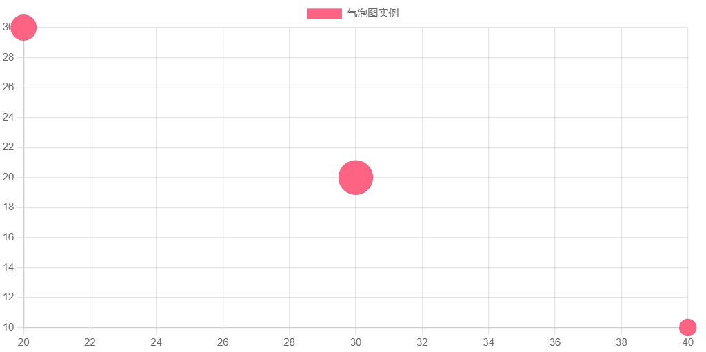
Chart.js 环形图
环形图又叫做甜甜圈图,其本质是饼图将中间区域挖空。
环形图是由两个及两个以上大小不一的饼图叠在一起,挖去中间的部分所构成的图形。
饼图是用圆形及圆内扇形的角度来表示数值大小的图形,它主要用于表示一个样本(或总体)中各组成部分的数据占全部数据的比例,对于研究结构性问题十分有用。
环形图与饼图类似,但又有区别。环形图中间有一个”空洞”,每个样本用一个环来表示,样本中的每一部分数据用环中的一段表示。因此环形图可显示多个样本各部分所占的相应比例,从而有利于构成的比较研究。
环形图 type 属性为 doughnut ,type 描述了图表类型。
接下来我们创建一个简单的环形图:
1 | const myCanvas = document.getElementById("myChart"); |
以上实例输出结果为:
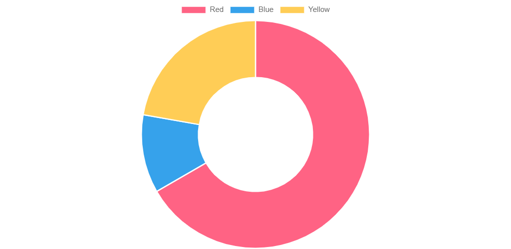
Chart.js 饼图
饼图,或称饼状图,是一个划分为几个扇形的圆形统计图表,用于描述量、频率或百分比之间的相对关系。在饼图中,每个扇区的弧长(以及圆心角和面积)大小为其所表示的数量的比例。这些扇区合在一起刚好是一个完全的圆形。顾名思义,这些扇区拼成了一个切开的饼形图案。
饼图 type 属性为 pie ,type 描述了图表类型。
接下来我们创建一个简单的饼图:
1 | const myCanvas = document.getElementById("myChart"); |
以上实例输出结果为:
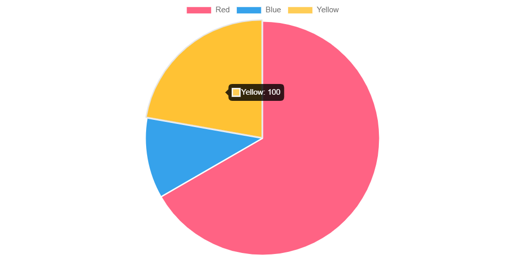
Chart.js 折线图
折线图是排列在工作表的列或行中的数据可以绘制到折线图中。
折线图可以显示随时间(根据常用比例设置)而变化的连续数据,因此非常适用于显示在相等时间间隔下数据的趋势。
折线图 type 属性为 line ,type 描述了图表类型。
接下来我们创建一个简单的折线图:
1 | const myCanvas = document.getElementById("myChart"); |
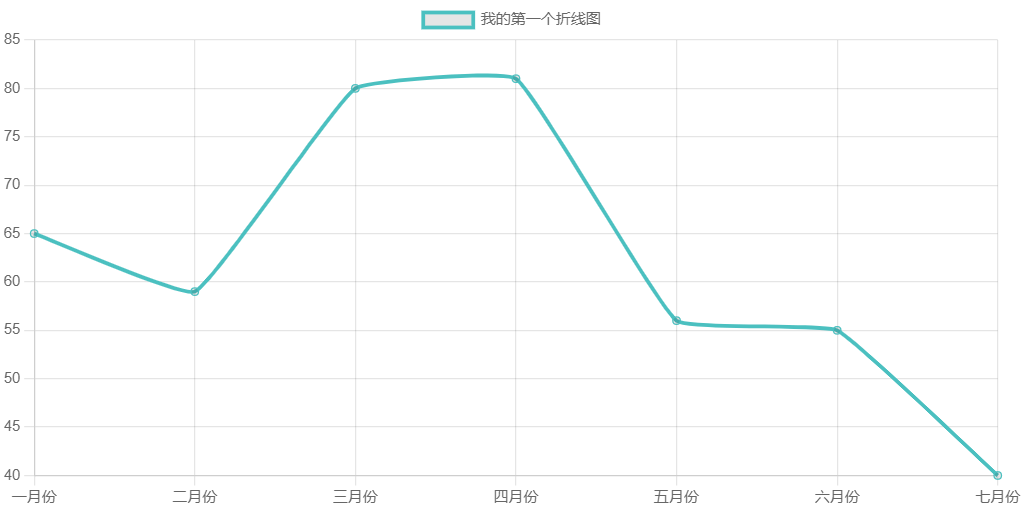
Chart.js 混合图
Chart.js 可以创建由两种或多种不同图表类型组合而成的混合图表,比如条形图与折线图的混合。
创建混合图表时,我们在每个数据集上指定图表类型。
混合图 type 属性为 scatter。
柱形图 type 属性为 bar ,折线图 type 属性为 line , type 描述了图表类型。
接下来我们创建一个简单的混合图:
1 | const myCanvas = document.getElementById("myChart"); |
以上实例输出结果为:
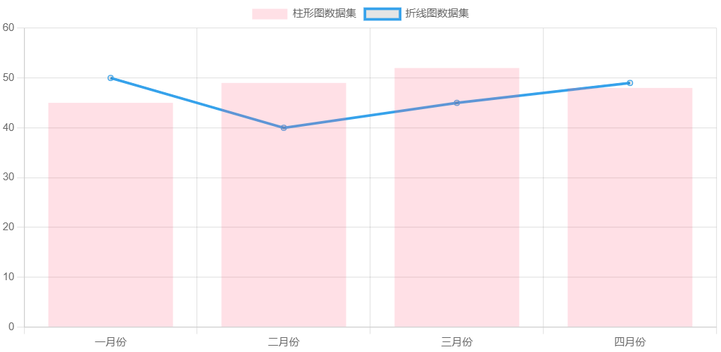
Chart.js 极地图
极区图类似于饼图,但每个数据集具有相同的角度,线段的半径根据提供的值有所不同。
混合图 type 属性为 polarArea。
接下来我们创建一个简单的极地图:
1 | const ctx = document.getElementById("myChart"); |
以上实例输出结果为:
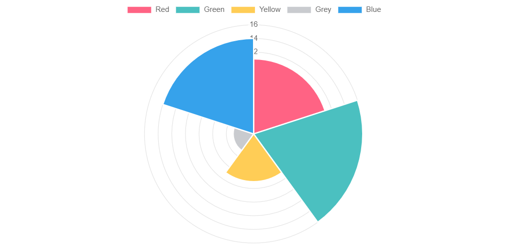
Chart.js 雷达图
雷达图是一种显示多个数据点及其之间变化的方式。
雷达图是以从同一点开始的轴上表示的三个或更多个定量变量的二维图表的形式显示多变量数据的图形方法。
轴的相对位置和角度通常是无信息的。
混合图 type 属性为 radar。
接下来我们创建一个简单的雷达图:
1 | const ctx = document.getElementById("myChart"); |
以上实例输出结果为:
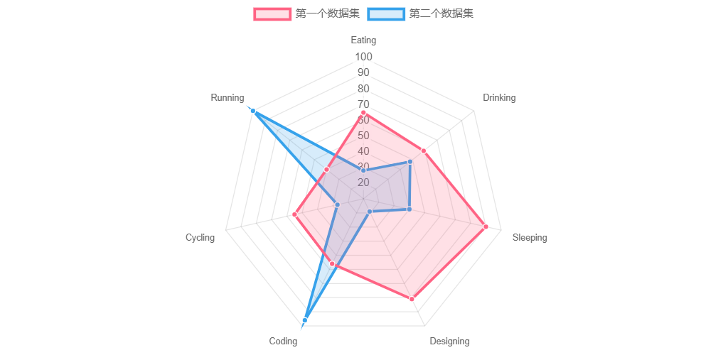
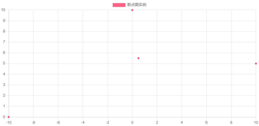
Chart.js 散点图
散点图是由两组数据构成多个坐标点,考察坐标点的分布,判断两变量之间是否存在某种关联或总结坐标点的分布模式。
散点图 type 属性为 scatter。
1 | const ctx = document.getElementById("myChart"); |
以上实例输出结果为: